community logos (iteration 2)
a project exploring ideas for community logos
Introduction
This is Iteration 2 of exploring ideas for logos for the Neuro-Symbolic Systems AI research community that is emerging within the Computer Science department at City, University of London.
Feedback from Ernesto and Tillman with respect to Iteration 1 indicated that those ideas weren’t heading in the right direction. Hopefully the direction of travel of Iteration 2 is more promising.
Source image that inspired Iteration 2

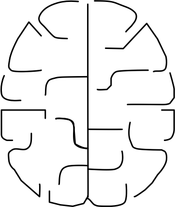
Brain cortex trace
Using my diagramming tool, I created a trace of the cortex lines appearing in the source image. My trace, seen here, is a bit rough yet, and perhaps it’s too close to the original, but we’re just exploring for ideas at this stage. The trace then serves as a base for exploring a several related motifs for stand-alone brain icons and associated community logos (where the icons are combined with a community name and tagline).
Motif 1
First attempt.

Motif 2
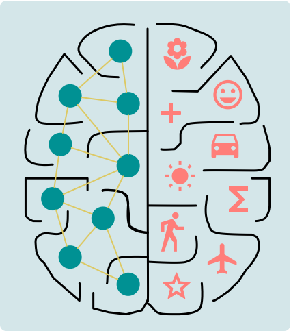
Second attempt. Same as motif 1 but with slightly larger neurons, yellow neuron connections and some symbols a bit larger.

Interlude
After having created motif 2, I switched directions and began exploring different icon designs. These explorations can be reviewed in Iterations 3 and 4 of the overall community icon/logo design project.
During Iterations 3 and 4, I experimented with several other icon design ideas and learned more about how to use my diagramming tool. As a result, I decided to return here, to Iteration 2, and to continue exploring further refinements and variations of the basic brain icon design idea established in motifs 1 and 2, above. These refinements and variations are borrowed mostly from Iteration 3.
Motif 3
Motif 3 adapts the design of motifs 1 and 2 by using:
- neurons that are open and large, with connections equally fat and of the same colour
- symbols whose size is as large as space allows
- brain cortex lines unchanged from motifs 1 and 2 (i.e. still with a fairly thin stroke)
- proper stroke scaling of the cortex lines (so they don’t, inadvertently, appear fatter as the icon is shrunk in size, as can be seen to happen in the logos for motifs 1 and 2)
motif 3a - white background
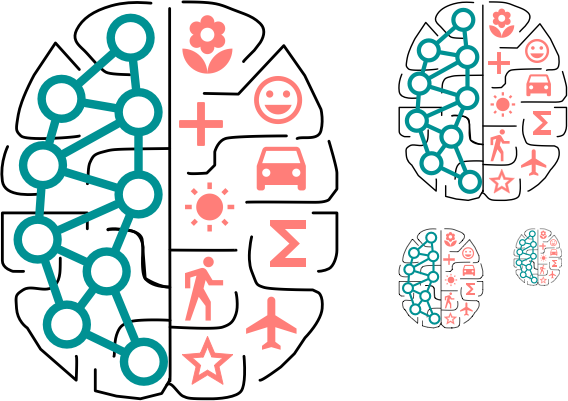
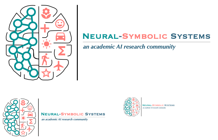
Now that the brain cortex strokes are being properly scaled, notice how they appear to fade as the icon is shrunk in size. This, for me, is undesireable; the icon loses visual impact at smaller scales. But others may take a different view.
motif 3b - coloured background
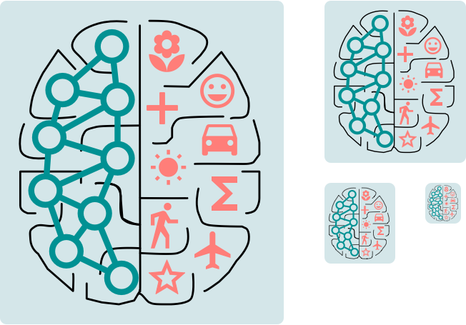
The icons and logos presented here are identical to those in motif 3a except for the coloured background. Notice how the brain cortex lines still appear to fade at smaller scales.
Motif 4
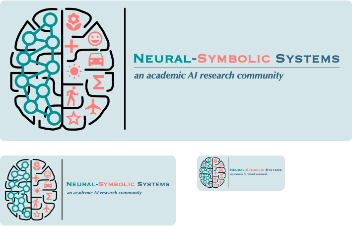
Motif 4 is identical to motif 3 except that it uses fatter brain cortex strokes.
motif 4a - white background
Notice how the fatter brain cortex strokes still fade somewhat at smaller scales. But they are clearer and sharper at small scales, and the icon is better for it (for me).
motif 4b - coloured background
The icons and logos presented here are identical to those in motif 4a except for the coloured background.
Motif 5
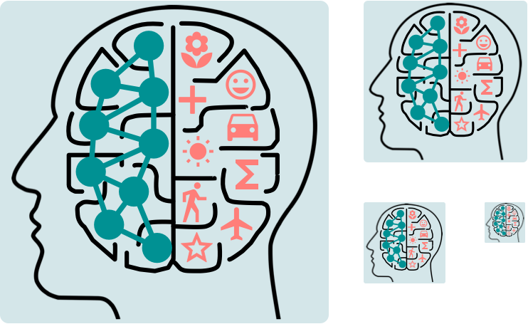
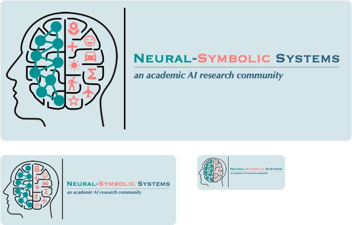
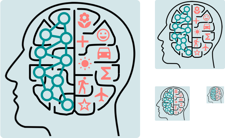
In Iteration 3 of this icon/logo design project, we explored the idea of introducing a human head figure into the design of the icon. Here, in motif 5, we borrow the human head figure used in Iteration 3. The brain icon design used here in motif 5 is identical to that of motif 4; the only difference is that we place the brain icon within an enclosing human head figure.
motif 5a - white background
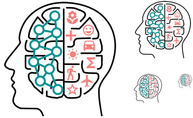
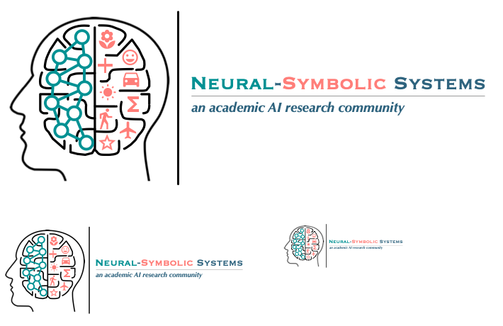
With the human head figure wrapping the brain icon, one thing to ponder is whether the black stroke of the head clashes with the black stroke of the brain cortex. Perhaps these should be different colours?
motif 5b - coloured background
The icons and logos presented here are identical to those in motif 5a except for the coloured background.

Motif 6
Motif 6 is identical to motif 4 except that the neurons have a solid fill (as in motifs 1 and 2, above) instead of being open.
motif 6a - white background

motif 6b - coloured background
The icons and logos presented here are identical to those in motif 6a except for the coloured background.
Motif 7
Motif 7 uses the brain icon of motif 6 (where the neurons have a solid fill) but, like motif 5, places the brain icon within the human head figure.
motif 7a - white background
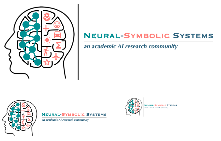
motif 7b - coloured background
The icons and logos presented here are identical to those in motif 7a except for the coloured background.
