community logos (iteration 3)
a project exploring ideas for community logos
Introduction
This is Iteration 3 of exploring ideas for logos for the Neuro-Symbolic Systems AI research community that is emerging within the Computer Science department at City, University of London.
I got positive feedback from some people regarding Iteration 2. One concern I have with the brain icon used in the logos of Iteration 2 is that it may be a bit too busy — too detailed. That is, it may be trying to pack too many neurons and too many symbols into the image. When viewed at a large scale one may get a positive impression because one can readily discern all the detail, but when it’s compressed to a small scale the detail appears to me to be harder to discern, and the image loses some of its visual impact.
So the purpose of Iteration 3 is to explore refinements to the brain icon of Iteration 2. The concept remains the same, but here in Iteration 3 we’re going to explore a courser (less granular) brain cortex that admits fewer but larger neurons and symbols. We wish to check whether such brain icons, when viewed at small scales, have greater visual impact than the brain icon of Iteration 2.
A second purpose of Iteration 3 is to explore the option of placing a refined, more discernable brain icon within a human head figure. We wish to check whether having a surrounding human head figure makes for a more visually appealing icon or not.
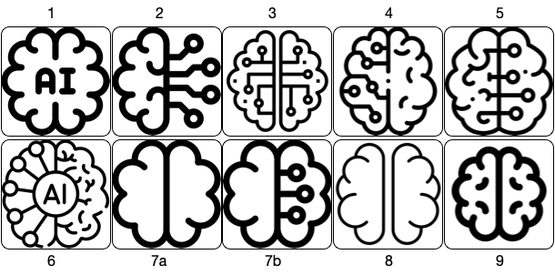
We begin by presenting two samples of brain images, followed by two samples of head-with-brain images. Some of these images are sourced from flaticon (a site discovered by Ernesto). A couple of the head-with-brain images are sourced from Pixaby. The rest are from miscellaneous sources.
The plan is to choose a preferred brain image, and a preferred human head image, and use these to create: 1) an Iteration 3 brain icon, with associated NSS logo, and 2) an Iteration 3 head-with-brain icon, with associated NSS logo.
Flaticon brain images
Other brain images

Flaticon head-with-brain images

Other head-with-brain images

Community icon & logo motif 1: brain
icon development
I chose to begin composing Iteration 3 community icon & logo motifs by working with Flaticon brain image number 3. I created a trace of the outline of the right hemisphere, added a rotated copy, introduced a reduced number of neurons/symbols, and came up these:
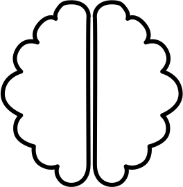
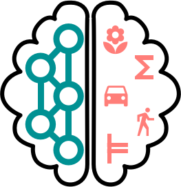
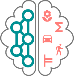
Middle image The hemispheres are populated with fewer and larger neurons/symbols than in the Iteration 2 motif. I've chosen to explore an approach for rendering the networked neurons that's different from Iteration 2. Here, we experiment with fat, open neurons, and connections that are equally fat and of the same colour. For the symbols, I've selected a subset of those appearing in the Iteration 2 brain icon motif, but I've also introduced a new one --- the one at the bottom. Hopefully, academically-oriented people (the target audience for our community logo) will recognise it as the entails symbol, from logic. So two of the five symbols have an 'academic feel', the summation symbol (to evoke math) and the entails symbol (to evoke logic). We can refine and finesse the choice of symbols later.
Right image Same as the middle image but with a steel grey (rather than black) cortex outline and a somewhat thinner cortex stroke.
If we add some backing colour, we get an icon that looks like this:
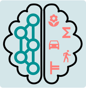

Or like this:
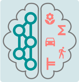
logo development
If we add a community name and tagline, we get a logo that looks like this:


Or like this:

Community icon & logo motif 2: head-with-brain
icon development
To explore motifs involving human head figures, I chose to work with image number 7 from the ‘head-with-brain’ images displayed above. This is a Pixabay image. Masking the original neuron contents yields a blank slate human head figure.

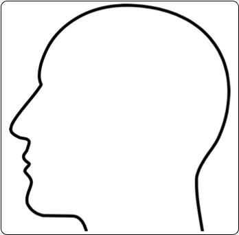
If we now fit our brain icons within the empty human head figure, we get head-with-brain icons such as these:
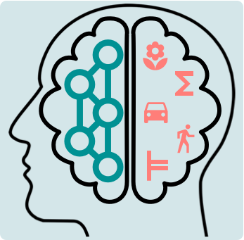
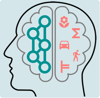
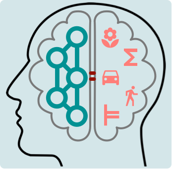
These images help to explain why I started to consider our brain icon with a thinner, grey outline of the cortex, as opposed to the thicker, black cortex outline. For me, the black brain cortex outline clashes somewhat with the human head figure when the two are juxtaposed, as in the left image. The softer, thinner, grey cortex outline feels a bit easier on the eye.
logo development
Adding a community name and tagline gives a logo like this:
Community icon & logo motif 3: head-with-contents
Motif 3 explores the human head figure with the neuron-symbol contents but without the brain cortex hemispheres.
Community icon & logo motif 4: two heads facing each other
Motif 4 considers the use of two heads facing each other, one containing neurons, the other containing symbols.

Using icons like these, a logo might look something like this:
