community logos (iteration 6)
a project exploring ideas for community logos
Introduction
This is iteration 6 of a project exploring ideas for icons/logos for the Neurosymbolic Systems AI research group emerging at City, University of London.
The previous iteration, (5), explored alternative colour combinations for the neural, symbolic and background components of a particular preferred icon design. The current iteration, (6), explores alternative symbols for representing the symbolic component of the preferred neural-symbolic icon.
There are multiple constituencies (domain specialisms) at City which may have an interest in feeling that their domain is represented by an appropriate symbol in the icon designed for City’s neurosymbolic AI research community. A request was put to me to search for candidate symbols to represent these various domains.
The following 8 domains were specified:
- health / life sciencies / bioinformatics
- energy
- environment
- industry / manufacturing
- transport
- defence / security
- food / food policy
- logic
The current design of the preferred icon already caters to hosting 9 symbols. So it has the capacity to host at least one symbol from each of these domains of interest.
All of the candidate symbols displayed on this page are organised according to these 8 categories. There is also an additional 9th category, miscellaneous, which displays various other symbols that may be of interest.
So far, feedback regarding colour combinations for the icon (as explored in iteration 5) indicate strong convergence around a preference for black-coloured symbols. Hence, all of the candidate symbols presented here are coloured black. All of the symbols shown here, however, share a particular format that allows their colour to be changed, should a desire for a non-black symbol colour arise in future.
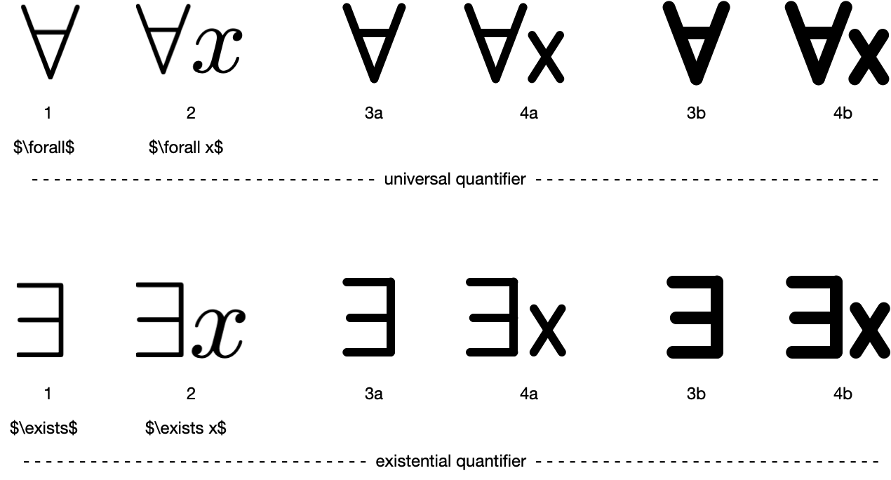
Sometimes multiple versions of the same symbol are displayed. The motivation for this is to illustrate the visual effect of using thinner vs thicker strokes. A thicker stroke is likely to make the symbol stand out better when it is placed within the overall neurosymbolic icon. But sometimes a thicker stroke can blur a symbol’s definition or make it less immediately recognisable (e.g. with logic symbols such as universal and existential quantifiers). Multiple versions of the same symbol are indicated by letters on their identification numbers (e.g. 1a, 1b, 1c). Only some of the symbols capable of having their stroke thickness altered have in fact been explored in this way. So if you like a particular symbol but only one version of it is displayed, it may still be possible to explore modified versions of the symbol.
Many of the symbols displayed on this page appear to have white-coloured internal regions surrounded by a black stroke or black body. While these internal regions appear to be white-coloured on this webpage, in fact they are almost always ‘clear’ or ‘open’ regions that will take on the background colour of the neurosymbolic icon, whatever that happens to be (expected to be white or some shade of grey). One should keep this in mind when interpreting the look of the symbols within the target icon. It may well be feasible to arrange for these internal regions to be white even against a non-white background, but that would introduce a 4th colour to an otherwise 3-colour colour scheme.
Some of the symbols appear in more than one domain category.
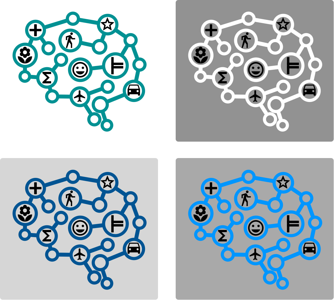
The icon and some preferred colour schemes
For convenience, here we remind viewers of 1) the preferred neurosymbolic icon design, 2) some of colour schemes for which people have expressed preferences (using an arbitrary sampling of background shades), and 3) the original set of 9 symbols.
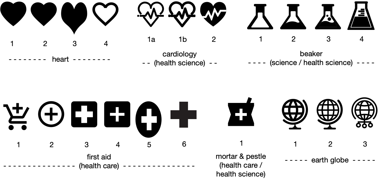
Domain: health / life sciences / bioinformatics
Here are the symbols identified so far that bear some relation to this domain category.
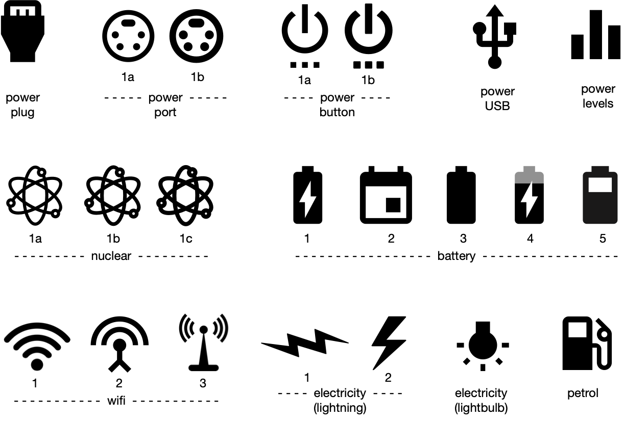
Domain: energy
Here are the symbols identified so far that bear some relation to this domain category.
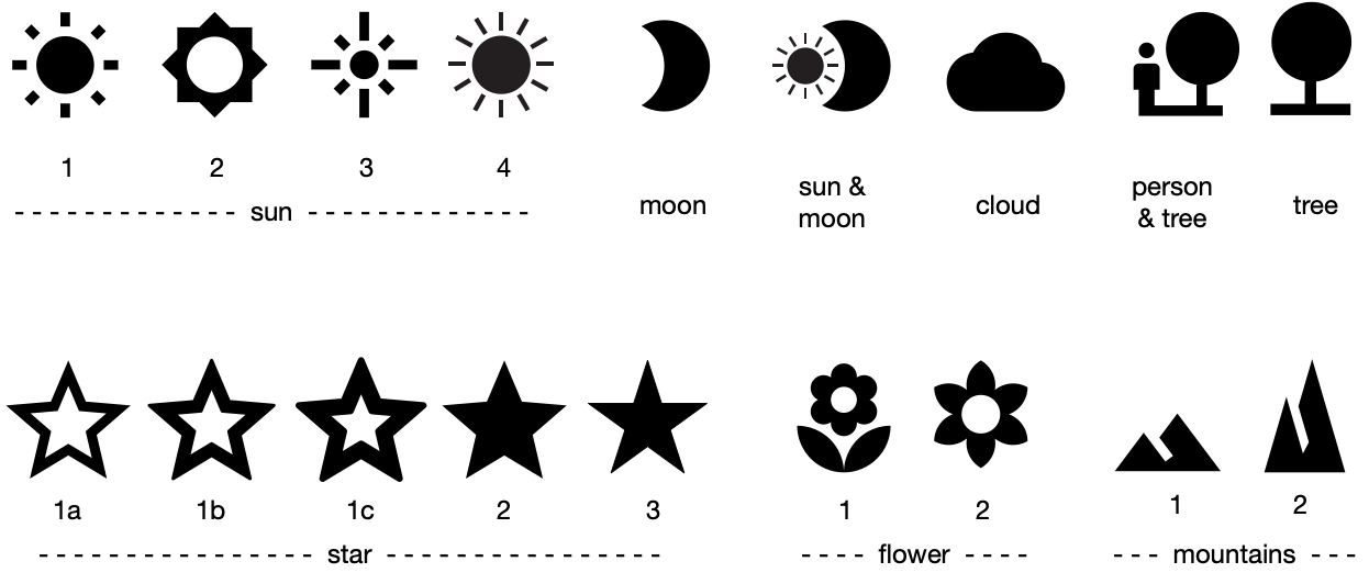
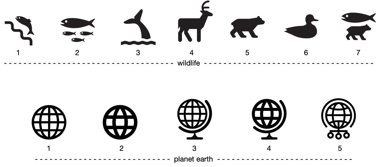
Domain: environment
Here are the symbols identified so far that bear some relation to this domain category.
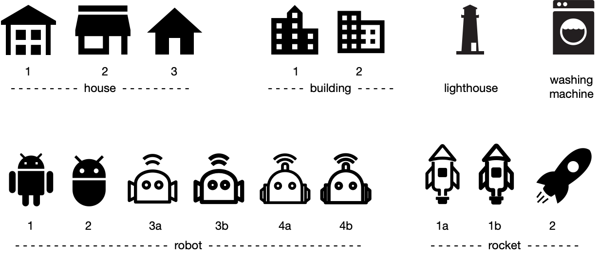
Domain: industry / manufacturing
Here are the symbols identified so far that bear some relation to this domain category.
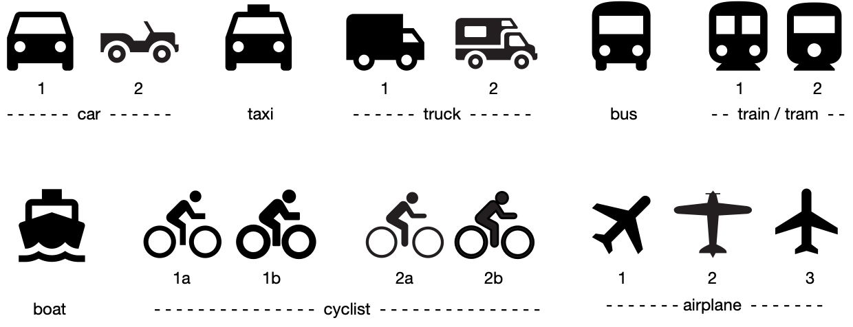
Domain: transport
Here are the symbols identified so far that bear some relation to this domain category.
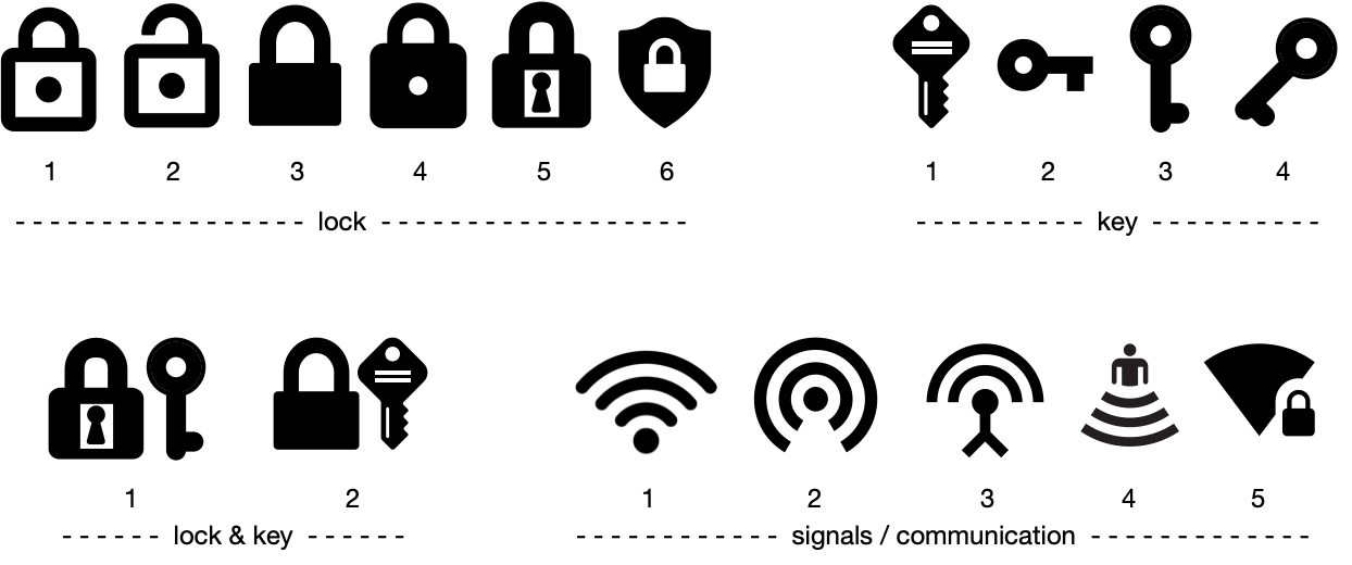
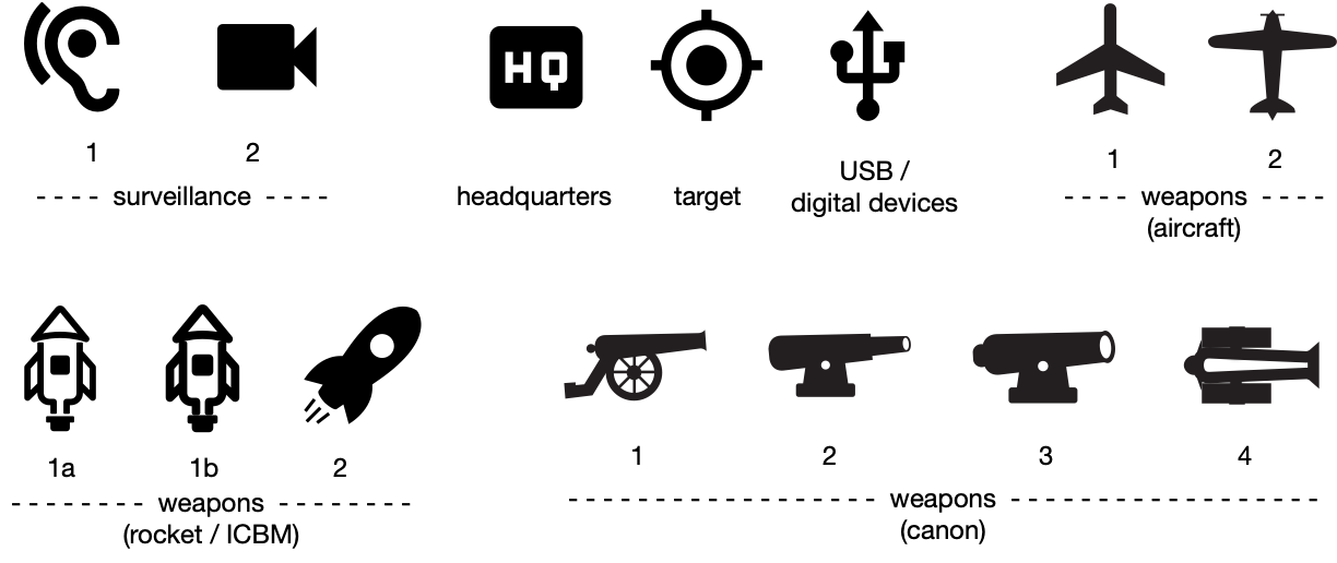
Domain: defence / security
Here are the symbols identified so far that bear some relation to this domain category.
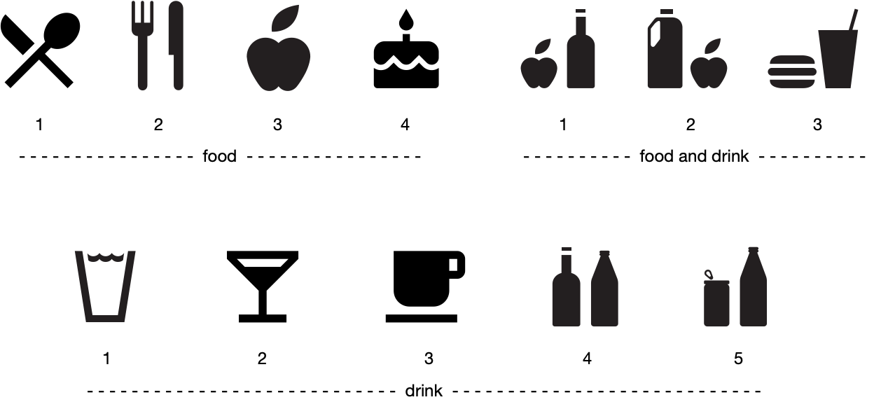
Domain: food / food policy
Here are the symbols identified so far that bear some relation to this domain category.
Domain: logic
Here are the symbols identified so far that bear some relation to this domain category.
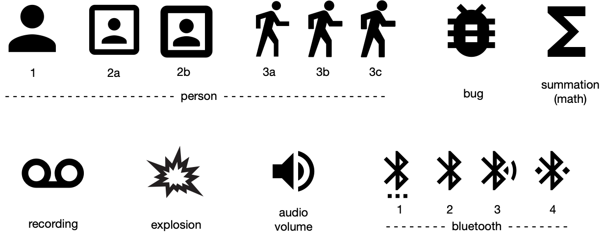
Domain: miscellaneous
Here are the symbols identified so far that bear some relation to this domain category.
